While I agree that the default UI is strangely bland (considering the candy-coated colors of Win8), like any other MS transition, with a little poking around we can find ways to tweak office to make most users happy.
1. Hiding the start page.
The Start page is the page with the really huge icons that displays each time you open word or excel. If you are like me, it would save you a mouse click to just jump to the blank document 99% of the time. So here is how we hide it:
a. Open the office app
b. Click the blank document icon
c. Click File > Options > General
d. Uncheck the "Show the Start screen" option (it is in the same place for excel)
2. Getting your ribbon back
When I first started up word, the ribbons were hidden. It can be annoying to have to click on the ribbon tab to display it each time. To make it stick around:
a. First click on the ribbon tab (such as HOME)
b. Then click the pin on the right bottom of the ribbon
3. Change the Default Save location
When you click save as, it will default to sharepoint or skydrive. If you would like to change the default option that comes up and save another mouse click:
a. Go to Options > Save
b. Check the box for Save to Computer by Default and set the default file location
4. Remove the all-caps from the ribbon tabs.
If you are tired of the flaming all caps ribbon tabs, here is an easy way to change them. I was able to change all but the FILE tab. It is amazing how much more readable the tabs are with this simple change.
a. Go to Options > Customize Ribbon
b. In the right hand pane, right click on each ribbon name you want to change and choose rename
c. The name should already be in upper/lower case. Type a space after the name and click ok
5. Change the information your status bar displays
Yes, the little bar at the bottom of the your app can display lots of helpful info and functions.
a. Right click on the status bar and choose the options you want. I like to display line numbers in word and add num-lock and caps lock in excel.
6. Color scheme
Now for the most annoying part. The extreme white-out color scheme. The issue is really not the lack of color, but the high contrast color scheme. No additional color schemes have been offered, so there is not really a good fix, but here are some things you can try that might make it more tolerable for you.
a. Turn down the brightness on your monitor.
b. Go to File > Account and try a different color scheme. Granted, there is only white, light gray, and dark gray, but pick the one that is best for you.
c. In outlook, select view > View Settings > Other Settings and set the grid line style to solid.
d. In outlook, select view > View Settings > Conditional Formatting. For the unread messages, change the font to bold italic to help differentiate new messages.
7. Reclaim some screen real estate in outlook.
By default the new outlook places a one line preview on each message in the preview pane. This greatly reduces the number of messages you can see at once in the list and causes lots of scolling. To turn this off:
a. Click the View Tab
b. Choose Message Preview
c. Choose Off
Change view to compact
a. Click the View Tab
b. Click Change View
c. Choose Compact
Remove the Profile Picture from the email
a. Click File > Options > People
b. Uncheck show user photographs
Shrink the Task Bar at the bottom
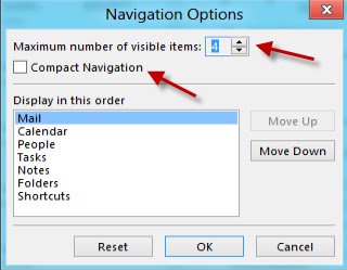
a. Click the ellipse on the task bar and choose Navigation Options
b. Edit the display order if you like and choose compact navigation. This option will shrink the task bar and limit it to the left pane, reclaiming almost an inch of screen space in the reading pane.
Change to Reading Pane on the right layout.
a. Click View > Reading Pane > Right
Being a longtime "reading pane on the bottom" guy, it really ticks me off, but the engineers and testers have admitted that they all use reading pane on the right mode, so they didn't notice the severity to which they screwed up the other options with things like the email header that the user can't remove. Indeed, when you change it to the right, it is imediately apparent that the entire outlook app layout was redesigned to accomodate only this view.


